

When it comes to creating the ultimate useful and intuitive data visualization, there is a lot to know besides how to use your favourite data visualization tool. There are visualization best practices relating to the presentation of data in visual form that supersede the mechanics of tools like Tableau, Power BI, QlikView, etc.
Optimus SBR Data specialists have identified 6 Essential Data Visualization Best Practices. Adhering to these best practices makes it easier and faster for users to gain insight from large volumes of data and thereby make the best decisions for their business.
Why Data Visualization Best Practices are Important
Within the scientific world is a discipline known as cognitive psychology. It deals with the mental processes such as attention, perception, creativity, thinking, etc. One of the processes in that list is incredibly important to data visualization… perception. Perception is the process by which the human brain takes in external stimuli from its environment. More specific to this discussion, perception is the process by which the brain “sees” information in a dashboard.
Pre-attentive processing
Perception involves almost subconscious processing of visuals. There is very limited information that can be processed this way. Pre-attentive processing are things that can be processed without conscious attention, such as position, colour (hue and intensity), alignment, size, and shape. Other things cannot be processed pre-attentively such as text and numbers.
How important is pre-attentive processing? Extremely important. If you use pre-attentive visual features, your end-users can process the information in 40-50 milliseconds, or even up to 200 milliseconds on the high end.
 Take a look at the image to the right. Which shape is different, and how long did it take you to see it? If you’re like the average person, it took you 40-50 milliseconds to spot the slanted shape.
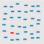 And take a look at this image. Which one is different? Again, spotting the red one should have taken you about 40-50 milliseconds.
The word most laypeople will use for a highly pre-attentive data visual is “intuitive”. The ultimate dashboard is one where your end-user can see and understand what they need to know without even touching their mouse or clicking on anything.
Why go to all this trouble? Pre-attentive processing is a non-physical process within the human brain, meaning it doesn’t physically alter the brain, as opposed to attentive processing which requires physical changes in the synapses between neurons. To simplify this a bit, think of this metaphor… pre-attentive processing is a phone call, as opposed to attentive processing, which requires building the phone lines first, and then making the call. This makes a huge difference in terms of how rapidly your end-users will understand your visual.
All of this is to define why best practices in data visualization are important. Presuming you are now a believer, here is our list:
6 Essential Data Visualization Best Practices
1. Have a Methodology
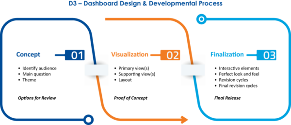
Define a process by which you obtain your design requirements and data, design visuals, and release them. Only a well-defined methodology will ensure consistent quality and continuous improvement in your data visuals. We use D3 Dashboard Design & Development, a methodology we have perfected to ensure all elements critical to the creation of highly effective dashboards are addressed.
2. Define Resulting Actions
Define the actions you would expect your end-users to take after viewing the dashboard to ensure relevance and usefulness are optimized for them. For example, a dashboard showing where activities are falling short of goals allows end-users to identify specific tactics or activities that are under performing, explore further to find out why, and take action.
3. Classify Your Dashboard
There are three types of dashboards: operational, strategic/executive, and analytical. Know what each one is, general traits of each, and classify your dashboard as one of these three. This will help guide your initial design decisions. Here’s a brief definition of each type of dashboard:
-
Operational Dashboard – a regularly updated answer to a question or line of inquiry that frequently monitors operational concerns in response to events or on an ad-hoc basis
-
Strategic/Executive Dashboard – a high level view of a question or line of inquiry that is usually answered in a routine, specific way and usually presents KPIs in a minimally interactive way
-
Analytical Dashboard – a highly interactive view that provides a variety of investigative approaches to a specific central topic with a few corollary contextual views
4. Profile Your Data
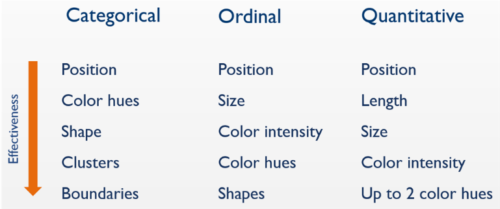
Make sure you profile the type of data your visual will be using. There are three types of data: categorical, ordinal, and quantitative. Different visual features work better with different types of data. For example, scatter plots work well with two pieces of quantitative data, whereas line charts work best for date ordinal data. Conversely line charts are a poor choice for (non-ordinal) categorical data as line charts imply continuity. Here’s a brief definition of each type of data:
-
Categorical – data that logically belongs together, such as: North America, Europe, and Asia
-
Ordinal – data that logically belongs together and has a logical sequence: gold, silver, and bronze medals
-
Quantitative – data that defines “how much” of something there is: $1 million in sales, 20° Celsius, 150 defects
5. Use Visual Features Properly
If you use visual features properly, you can “hack” your end-users’ brains without them even knowing it. There is a specific hierarchy of effective visual features based on the type of data used. This isn’t just some product manager’s preference – it is based on hard science involving decades of research, studies, and physiological measurement (e.g., PET and fMRI scans of the brain). Adhering to the hierarchy will avoid common mistakes in using visual features. For example, inexperienced visualizers commonly make the mistake of applying discrete colours to categorical data.
6. Design Iteratively
Visualization requires an understanding of the concept your end-users envisioned and their visual expectations. This is a notoriously difficult thing to accomplish, so designing iteratively is the best approach. Once an adequate understanding of the user requirements has been established, proofs of concept and prototypes should be designed to elicit feedback from end-users in an interactive setting. This way visualizations are developed iteratively with direct end-user involvement.
A Final Thought
Dashboard design is a complex science that can have a serious impact on how data is consumed and processed. By understanding pre-attentive processing, we’ve gone deep into the nitty gritty of visual best practices and in turn, ensure that every dashboard we design sets our end users up for success, and better decision making capabilities.
Optimus SBR’s Data Practice
Optimus SBR provides data advisory services customized to support the needs of public and private sector organizations. We offer an end-to-end solution, from data strategy and governance to visualization, insights and training. Click here for more information on our Data practice and how we can help you on your data journey.

Optimus SBR Celebrates 6 Consecutive Wins as 2024 Best Workplaces™ in Professional Services
Our commitment to a people-first approach has been central to being recognized in 2024 for the sixth time as one of the Best Workplaces™ in Professional Services and the key to our overall success.

12 Best Practices to Increase Cross-Team Collaboration and Enhance Organizational Alignment
Enhancing cross-team collaboration drives innovation, optimizes resources, improves overall performance, and ensures every part of your organization works toward the same goals.

Enhancing Your Data Strategy for Success: The Power of Metadata
Metadata goes beyond just aiding in data retrieval. It ensures your data is secure, compliant and, most importantly, understood consistently by everyone in the organization.
Optimizing Language Translation Strategies: Beyond Compliance to Enhanced Operational Efficiency
The introduction of Quebec’s Bill 96 in Canada underscores the necessity for comprehensive translation strategies. Integrating machine translation technologies helps meet regulatory requirements while enhancing translation speed, cost efficiency, and operational effectiveness.

How to Manage Gen Z: 16 Strategies to Engage and Retain Young Talent
These practical strategies lead to a workplace that is better aligned with the values and expectations of Gen Z employees, ensuring that your efforts to attract and retain Gen Z talent are both successful and sustainable.

How to Measure the Success of Learning and Development: 12 Important Metrics to Evaluate
Quantifying the success of L&D training programs can be challenging. Learn about selecting and measuring the right metrics to determine whether your training efforts are truly making an impact.