RFM (Recency, Frequency, Monetary) analysis is commonly used for customer segmentation, to split our users into specific groups. For example, people who visit a website regularly but don’t buy much would be a high “frequency” but a low “monetary” value visitor. With customer purchase information readily available, it is especially common to perform RFM analysis in retail where we want to create a view of our customer types without drowning in all the transactional data.
This page contains a comprehensive explanation and description.
When constructing RFM scores, one challenge is that the RFM metrics for customer segmentation are on completely different scales:
- Recency: time since last order (usually in days)
- Frequency: count of transactions or items purchased
- Monetary: total customer spend or average transaction value (dollars)
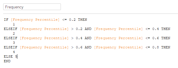
To compare them, we divide each metric into quintiles. If you are above the 80th percentile, your score is 5; if you are in the 60th to 80th percentile, your score is a 4 and so on.
What are the three components of the RFM formula?
Using the included Superstore dataset of customer purchase information, we’ll define RFM as follows:
- Frequency – number of orders
- Field: Number of Records
- Monetary – total sales
- Field: Sales
- Recency – last transaction
- Field: use the order date, calculate the number of days from a selected date, and take the minimum to get the most recent order
Four Steps to Achieve Our Goal:
- Calculate the percentile values for each customer (e.g. customer X is in the 93rd percentile of frequency)
- Compare these to the overall percentiles (since customer X is above the 80th percentile of frequency, they receive an F score of 5)
- Combine the fields
- Visualize/report the results
Notice that with 5×5×5 combinations, we have 125 possible combinations. However, in practice, our data won’t necessarily contain every combination. Certain data combinations like 4-1-5 or 2-5-1 are very uncommon because, generally, you don’t have loyal customers who are frequent visitors who don’t spend much and haven’t ordered regularly.
In situations like these with many possible combinations, it’s often helpful to provide Tableau with a scaffold. A scaffold is a separate table that lists all the possible values (125 combinations). When we join or blend this into our results, it guarantees that every possible value appears in the results, even if there are zero customers in that bin. Scaffolds are frequently helpful with dates where not every day exists in a dataset, but we would like to see a chart for activity every day. To start, I’ve created a sheet called “RFM all codes.” All it contains is a list of the 125 possible combinations:

Calculate Each Customer’s Percentile Value
With that setup, we need to calculate each person’s percentile. This can be easily done with the RANK_PERCENTILE table calculation:

We’ll then calculate the percentile with a simple if-then statement:
Completing this for each metric and combining them, we can now see the customers assigned to each RFM combination:

Great! Now let’s remove the customer names, so we can just see counts by RFM category.
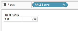
Wait a minute… how did everyone get in 555?
Unfortunately, this won’t work with table calculations like RANK_PERCENTILE. The issue is the view granularity. Since we haven’t broken it down by customer name, the calculations for percentiles all break. There’s only a single value for frequency now – the overall frequency – which is equal to the maximum, making it the 100th percentile. What to do?
Generally, in Tableau, many formulas that can be done as a table calculation can be re-done as a level of detail calculation. Table calculations are limited to the granularity of the view – there is no way to override that or change an option. Since the view is broken down by customer, I can’t roll it back up to the level of the whole dataset. However, with a level of detail expression, we can bypass the level of the view and define an overall 80th percentile, 60th percentile, and so on.
Table calculations are at the core of Tableau, and they solve many common calculation problems. The most common calculations like running total, moving average, change from the prior period, and Year-to-Date are available as “quick” table calculations, meaning Tableau will write the formula for you. But occasionally we run into situations like this where the table calculation doesn’t work. Enter the Level of Detail formula.
Level of Detail Formulas
Level of detail calculations were introduced in Tableau 9. They allow us to ignore filters or create formulas that aren’t dependent on dimensions in the view. The key to resolving this problem is the FIXED level of detail formula. In my experience, this is the most commonly used level of detail formula.
I’ll re-do my approach with Level of Detail expressions. First, to get the number of items for each customer, I’ll use the FIXED expression with the Customer Name.

This guarantees that the count of items purchased is at the customer level. Regardless of my view – a summary by state, zip code, or product subcategory – the Frequency is still calculated for each customer.
Comparing Customer Percentile to Overall Percentiles
How do we get the overall 80th percentile, so I can compare each customer’s score to that value? With another FIXED level of detail:
{ FIXED : PERCENTILE([Frequency LOD],0.8) }
Note this is a bit confusing in Tableau. PERCENTILE is an aggregation, like SUM(), MEDIAN(), COUNT() and so on. But RANK_PERCENTILE is a table calculation that is used on top of an aggregation. Table calculation and levels of detail can sometimes be combined, but in this case, we’ll keep them separate.
After creating these for each of recency, frequency, and monetary value, I need percentiles. Each person must be assigned to group 1-5 for each value. Time for another calculated field.
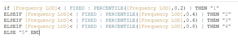
This ensures everyone is assigned to a “bin” for frequency. Notice I’ve made these text fields, so it will be easier to combine them, but they could just be numbers as well.
Combining the Fields
We’ll do the same for recency and monetary. Now I’ll combine everything into an RFM score with one more formula:

We could also create a group with this data, collapsing the 125 RFM combinations into 4 categories:

RFM values can be further grouped and boiled down – for example if you are an R of 1 or 2, and also an F of 1 or 2, you may be called a “hibernating” customer who is no longer engaged.
Visualizing the Results in Tableau and Summing up
Data visualization is a challenge for RFM. First, we have a lot of different categories – 110 of the 125 possible categories are present in our data. Secondly, there are three dimensions (R/F/M) and viewing anything in 3 dimensions is challenging.
To sum up, we’ve resolved the calculation of RFM scores by leveraging Level of Detail expressions. When you find yourself in a situation where table calculations are causing you problems, level of detail expressions or “LODs” are frequently the answer.
Often this comes down to understanding how Tableau thinks. It’s not necessarily immediately obvious that PERCENTILE is an aggregation, but RANK_PERCENTILE is a table calculation. However this is the key to resolving the RFM calculation; combining PERCENTILE with a FIXED level of detail expression.
Essentially, we need data at two levels at once: the value for a single customer, and the value across all customers. Level of detail formulas allow us to work on both levels simultaneously, while table calculations do not.
Thank you for following along. Please feel free to contact us to discuss RFM analysis in Tableau, or any other data question that may arise.
Optimus SBR’s Data & Analytics Practice
Optimus SBR provides data and analytics advisory services customized to support the needs of public and private sector organizations. We offer end-to-end solutions, from data strategy and governance to data management, data engineering, data architecture, data science, and data analytics.
Contact Us to learn more about our Data practice and how we can help you on your data journey.
Doug Wilson, Senior Vice President and Technology & Data Practice Lead
Doug.Wilson@optimussbr.com
Eric Tobias, Principal, Data Practice
Eric.Tobias@optimussbr.com


Industry Insights
Service Insights
Case Studies
Company News