Over the last month, I’ve come across several problems that clients were encountering with their visuals in Tableau. In this post I’d like to talk about three of them. These three problems were similar in the sense that they were all solved with lesser known table calculation functions. In each case, I’ll present the problem and how it was solved. I will be using the Superstore dataset to recreate the scenarios that were encountered.
1. LAST ()
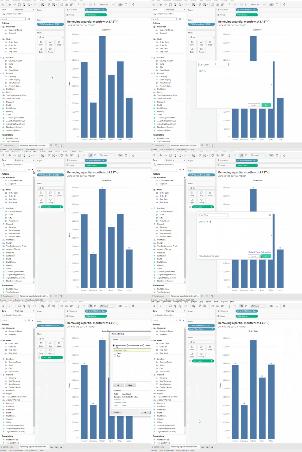
A client had a simple bar chart showing sales by month for the current year. They wanted to hide the last bar since it represented a partial month due to the fact that we were only halfway through June. This problem was a perfect candidate to be solved with the LAST () table calculation function.
The LAST () function returns the number of cells from the current cell to the last cell in the partition. This means that if we have six bars representing January to June, June would have a value of 0 since it is the last bar and January would have a value of 5 since it is 5 bars away from the last bar. To demonstrate this, I created a calculation called “Last Label” with the formula LAST () and put this on the label shelf.
To remove the last bar, we can create a calculated field called “Last Filter” with the formula LAST () = 0. This will return either true or false. We can put this field on the filter shelf and select false. This removes the partial month.

2. WINDOW_MAX ()
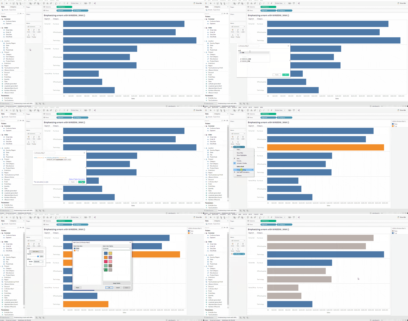
A client had a simple bar chart showing sales broken down by segment and product category. They wanted to emphasize the product category with the most sales per segment. This problem was a perfect candidate to use the WINDOW_MAX () table calculation function.
The WINDOW_MAX () function returns the maximum of the expression within the partition. If you are unfamiliar with the concept of a partition, I would encourage you to consider taking our Tableau Master Training (link to master class). Understanding addressing and partitioning is fundamental in correctly using table calculations in Tableau. You can think of a partition as the area of your chart in which the function WINDOW_MAX will look at to compute the maximum value of the expression that we specify.
We can use the WINDOW_MAX function to identify the product category with the most sales per segment. Then we can colour this bar so that it stands out against the other product categories. We can create a calculation “Is Window Max?” with the formula SUM([Sales]) = WINDOW_MAX(SUM([Sales])).
Let’s put this field on the colour shelf. You can see that Tableau is currently colouring the largest bar across the entire visual with a different colour. This is indicating that the current partition is in fact the entire table. This is not quite what we want. Let’s click on the “Is Window Max” pill and change the “Compute Using” value to “Pane (down)”. There we have it. Tableau is now colouring the product category with the highest sales per segment.

3. SIZE ()
A client had a visual that displayed sales by month for the past two years. The visual also showed subtotals and grand totals. This was a requirement. Displaying subtotals and grand totals created the problem of shrinking the monthly bars because the large total values increased the axis range of the chart. This made it difficult to see the monthly sales values and those were the most important part of the visual. The client wanted to display the subtotals and the grand total value but it didn’t have to be in the form of a bar. It could simply be a label. This problem was a perfect candidate for the SIZE () table calculation function.
The SIZE () function returns the number of cells in the partition. If you are already knowledgeable about table calculations, then you might know that totals are their own partition. We can take advantage of this to solve the problem.
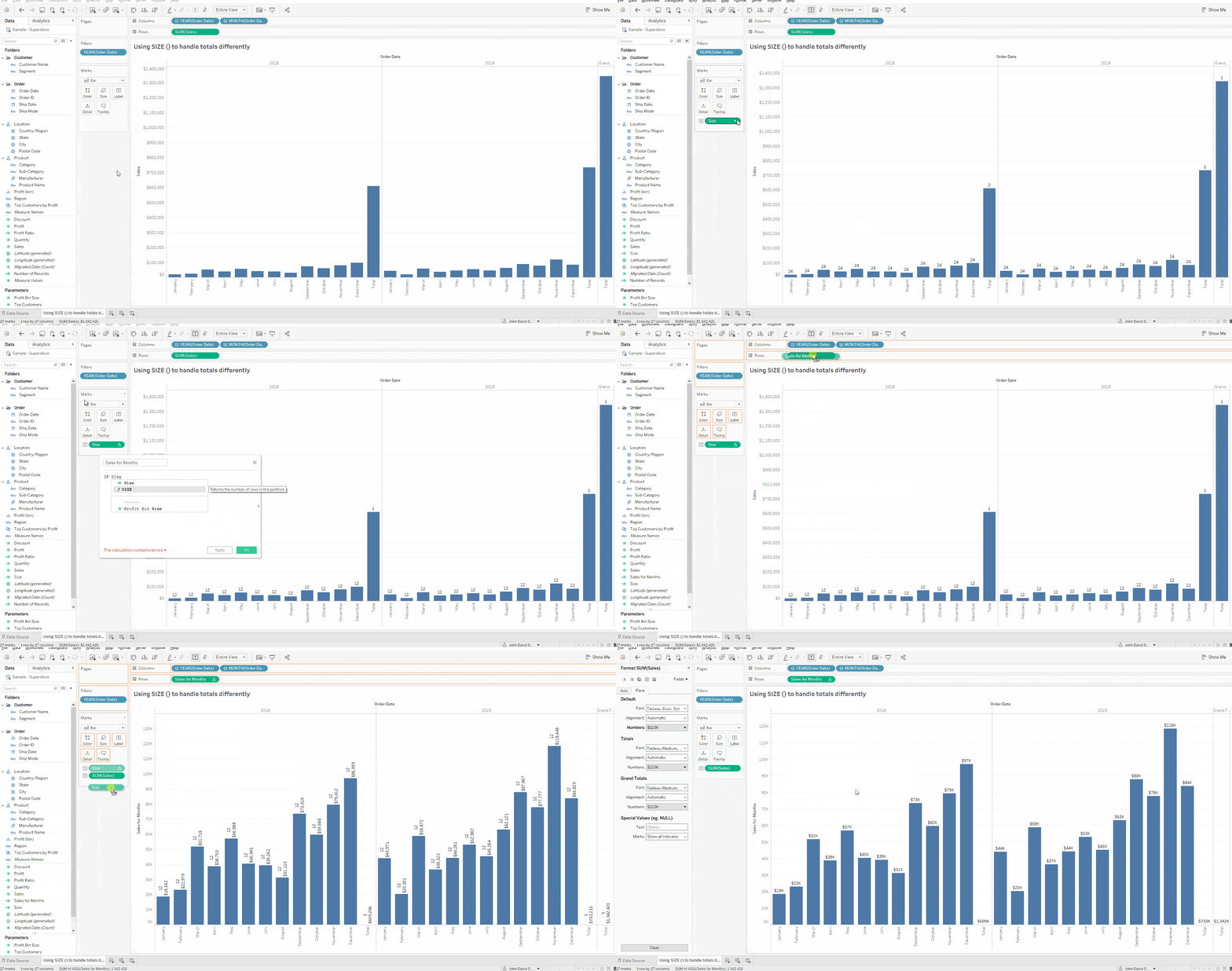
Our desired result will be to display the bars normally for the monthly figures. For subtotals and the grand total, we will display a label rather than a bar so we don’t skew the axis range. Let’s create a calculation called “Size” with the formula SIZE (). We’ll put this on the label shelf to see how this works. Let’s also change the addressing to “Pane (across)” so that our calculation is computing per year.
The monthly bars all have a label of 12. This is because there are 12 months per year. In other words, there are 12 cells or marks per partition. The subtotals and grand total on the other hand all have a value of 1. This is because totals are their own partition. The 2018 subtotal sales value is not lumped together with the 2018 monthly sales partition. It exists separately and is its own partition.
We can use this to our advantage in our next calculation. Let’s create a calculation called “Sales for Months” with the formula IF SIZE () = 1 THEN 0 ELSE SUM([Sales]) END. This calculation goes to each bar and checks how many bars are within the partition in which that bar resides in. For all the monthly bars, the size calculation will return 12, so our new field returns SUM([Sales]) due to the ELSE condition. For the subtotals and grand total, the size calculation returns a 1 and as a result the “Sales for Months” calculation will return a 0. This means that when we encounter a total, we won’t be displaying a bar.
Let’s replace SUM([Sales]) on the rows shelf with the “Sales for Months” field. Let’s make sure the addressing is “Pane (across)”. Let’s also put SUM([Sales]) on the label shelf. There we have it. We are no longer displaying bars for our totals which allows us to see the sales trend across months much easier now that our axis scale isn’t inflated due to the total values.
It is also worth mentioning that this approach won’t work if your partition legitimately has only one bar. For example, if you were displaying sales by year and we were in the month of January, then the partition would only have one bar. Consequently, the size function would return a value of 1 and the “Sales for Months” formula would treat January as a total.

And there you have it. Three visualization challenges solved with lesser known table calculations functions.
If you’re encountering a challenge with a Tableau visual, contact one of our Tableau professionals for assistance


Industry Insights
Service Insights
Case Studies
Company News